
ANIMATION
Hercules’ animation, much like its music, is extremely well done. Its characters are lively and distinct, its landscapes are beautiful--overall, it’s a beautiful film. While the few issues I have with its animation stop me from loving the animation as much as the music, it’s still absolutely one of Disney’s masterworks; in this section, I’m going to talk about how the freedom of animation elevates Hercules as a musical, the creative liberty the animators put into the character designs, then how the use of different animation styles both improved and take away from the viewing experience.
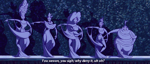
I’m of the opinion that animation lends itself to musicals extremely well, and Hercules does everything to prove my point. Unlike the limits of real-life choreography, the “choreography” in animated films have essentially no limits, so the animators of Hercules were able to get really creative. The most poignant example is, naturally, the Muses and how they interacted with each other and their environments. The way they were incorporated into the vases’ art in “The Gospel Truth” or the background structures in “I Won’t Say (I’m In Love)” was such a wonderful way of making their narrator roles work, and gave the animators so many interesting things to do--all made more enjoyable with the perfect coordination between characters that simply can’t be achieved physically. The abstract, geometric way characters are animated in Hercules also creates more freedom for more compelling choreography; an example being, once again, the Muses and the way they position themselves as different shapes in their pieces.
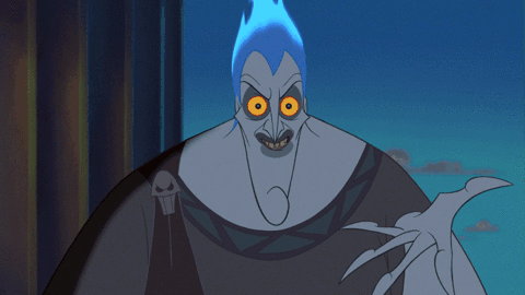
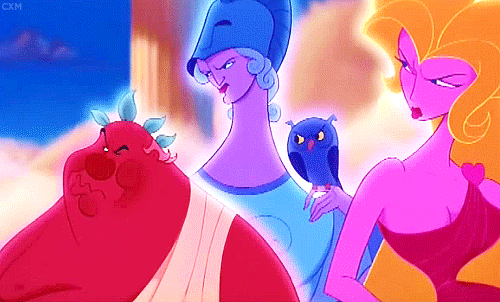
This character design was, of course, very intentional. When compared to the Greek vase art in “The Gospel Truth”, you can tell that the characters throughout were very inspired by classic Greek illustration: lots of clearly defined shapes and sharp edges. I actually really enjoy the feeling this design gives Hercules--I always thought it looked a bit different than other Disney movies, but I now realize that the Greek inspiration makes it stand out among the others. It wasn’t just Greek illustration that was in mind when the characters were designed for Hercules, however. It’s been noted by the animators that Phil and Hades were incredibly inspired by the looks and mannerisms of their voice actors Danny Devito and James Woods, respectively. I love the extra steps like this that the animators took to make characters feel very legitimate; due to this, Phil and Hades absolutely had the voices that fit them the best in the film. One last note when it comes to character design has got to be the use of color in Hercules. It isn’t hard to tell the contrast between the gods on Olympus with their bright, solid colors and the drab Hades in the dark Underworld--though it was a simple decision, it gives the film a stronger identity and makes it an easier watch for younger audiences, adding onto its all-ages appeal.
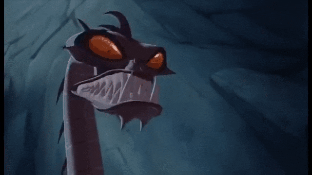
Since Hercules was the only truly animated movie we’ve watched this term, I realize my very positive outlook might be a bit biased, so let’s talk about something that really irked me about this film: the hydra scene. I understand that 3D animation was becoming the big new thing around Hercules’ time, but wow, this scene really took me out of the movie. The hydra itself didn’t even look all that bad, but it was a style so unlike the rest of the movie that it seemed a whole lot worse in context. What’s even worse is that, apparently, the fight scene with the hydra apparently took over a year and a half to create, all for something that really looked like it should’ve been in another movie. This is all with Hercules already showing that it can employ other sorts of animation to great effect; the Greek vases in “The Gospel Truth” is one example, with it both serving to reflect the film’s origins and isn’t too far off the film’s usual style to warrant a problem. Olympus, as well, is done in a beautiful, painted manner that reflects its otherworldliness more than anything. I can only assume, however, that I’m being quite grumpy. I’m sure younger audiences would absolutely adore how different that scene looks--I mean, young me sure did!